Hey there guys, John here.
Well, as you can see (if you’re reading this), The Movie Blog has undergone something of a facelift. I wanted to give everyone a day or two to use it before asking for your input and explaining why I made the changes. So first things first… why the changes? Well, partially because there have been a bunch of people requesting some changes… and partially because I wanted some changes too. So what have people been asking for?
1) Make the site easier to navigate.
One of the problems with the previous layouts of the site is that once a post goes up, it disappears off the front page pretty quick, leaving some people complaining that they have to go digging through the archives to find it again. So, I wanted a way to have more posts on the front page… so that posts can stay on there longer.
2) Less Scrolling
This is another one I got a lot of requests for. With the full posts on the front page, it meant having to scroll… and scroll… and scroll until you found a post that interested you (I know I like to believe that you’re all TOTALLY interested in every single post I do… but that’s not reality). By having the excerpted posts with a small graphic, it means you can see all the posts from that day very quickly and see which ones interest you… without having to scroll a bunch to get to one.
3) Highlighting Video and Podcast
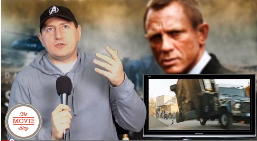
This is something I wanted. Everyone and their dog now has a movie website. I wanted a layout that would allow me to highlight a couple of elements that make us stand out… video and the Uncut Podcast in particular. We were the very first movie podcast on the internet (still the best damn movie related podcast on the internet), and we were also the first of the movie blogging sites to utilize video. This sets us apart a little, and I wanted to highlight those.
4) More focus on the reviews
I used to have that “most recent review/podcasts/features bar under the second post on the main page… but I’d get emails from time to time from people suggesting that I put more design focus on the movie reviews. It did seem to make sense to me since… well… this is a website where we talk about movies… and the movie review posts always seem to generate a lot of discussion. As you can see on the right side of the main page, the reviews are now more prominently highlighted.
So there you go. Now… I’m not done yet. I FORGOT TO ADD THE DAMN SEARCH BAR!!!! How stupid! I wanted to make the site more easy to navigate… and I forget to put the fricken search bar in there. Anyway, there is also a little work to do with adding content in the side bar of the individual post pages.
So now that you’ve had a couple of days to see and use The Movie Blog with the new layout, I thought I’d ask for your input. What do you think of the changes in general? Like it in general? Don’t like it in general? What additional changes or tweaking would you like to see me do? i eagerly await your feedback.

