Someone please tell me this is a fan made poster for Knight and Day.
A 12 year old fan with Gimp installed on his computer.
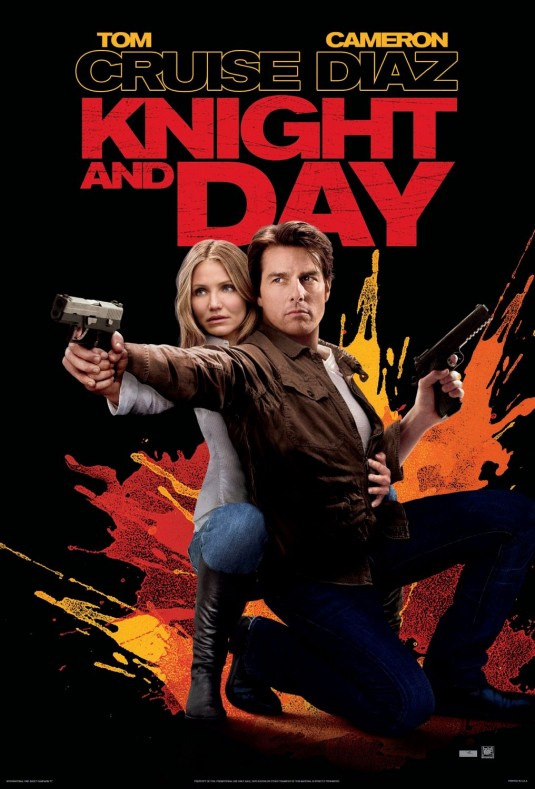
What suit took a look at this poster and said “Lets run that!” Seriously!?!
This is just terrible. I want someone to show proof that this is not a real poster because I got an email from the STUDIO media assets with the official poster a while back that resembles but is not quite like this one.
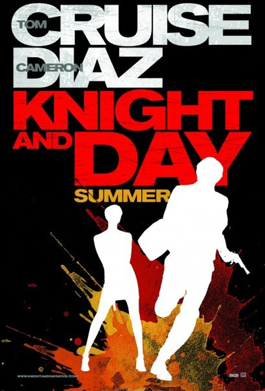
And while this new quick cut and paste job has a lot of the same elements, its just a cheap mess. The original artsy silhouette against the watercolour splatters works, and I really like the look of it. But perhaps for the international market they really wanted Cruise and Diaz’s faces on the poster. But then go with something else. Don’t try to stay artsy cool with the paint splatters and just scotch tape a still from the movie to the front of it.
Lame.


