Remember when a teaser poster was often more than just a logo.
Some simple but splashy image that in a brief glimpse would make you think “what’s that about?”
This isn’t it.
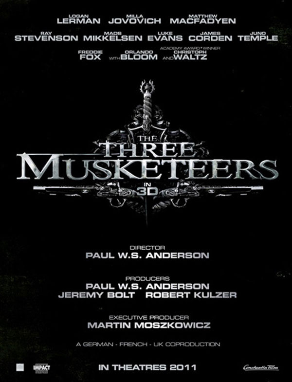
A teaser poster for Paul WS Anderson’s The Three Musketeers tells us a lot that we will likely find out reading the opening credits.

This makes me wonder if its a trade magazine poster. Like the kind of one sheet that gets pimped out to studios when they are trying to sell distribution or get it greenlit.
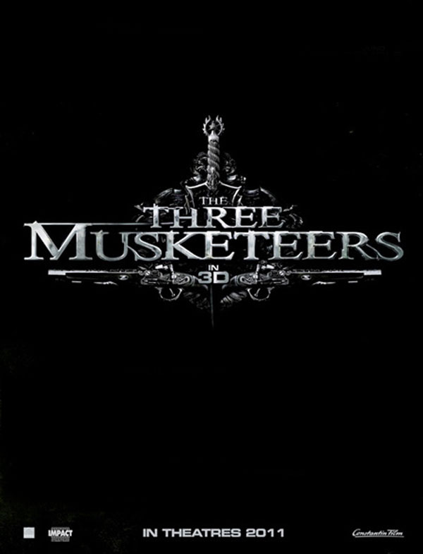
The logo is effective and looks to be the right period and era, but the littering of text and credits on the whole thing just distracts. If you want to share something, pick a detail and run with it. But this just seems like too much.
Here, I fixed it. Consider yourself teased.


