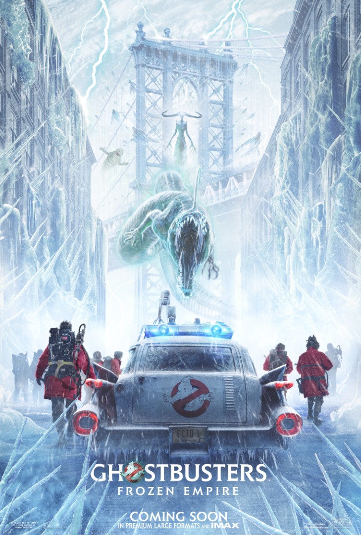
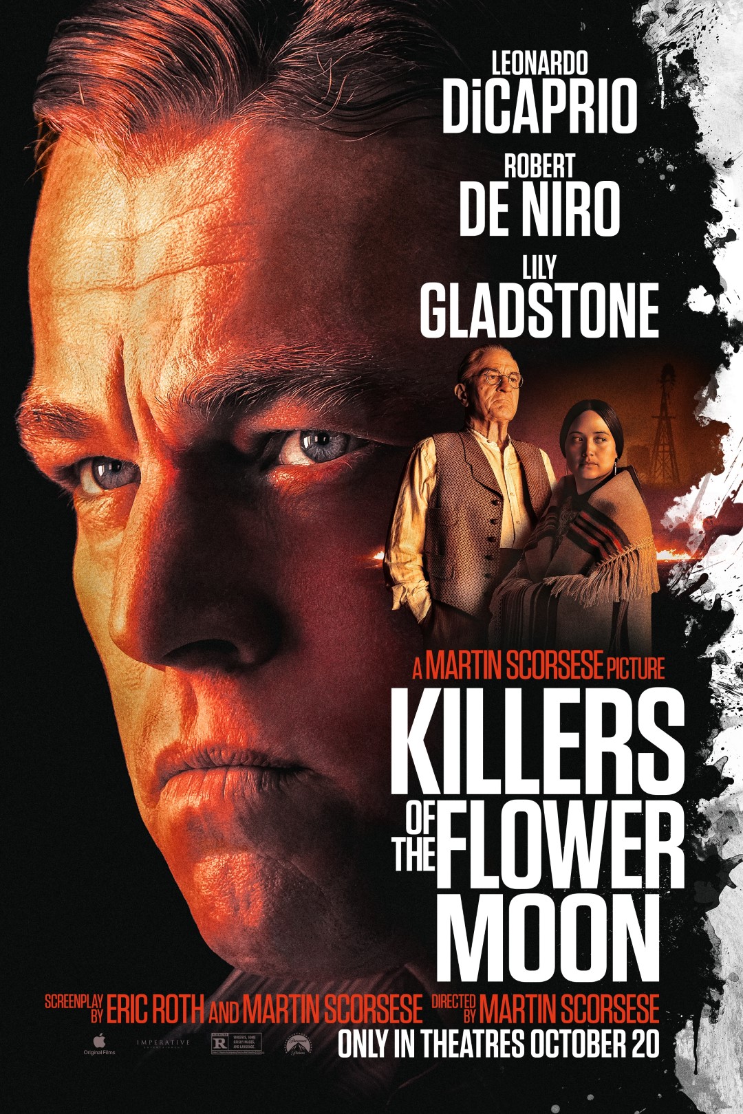
I stumbled across these posters for Matthew Vaughn’s Kick-Ass the other day and for the life of me I can’t figure out why they weren’t used. They have that cool ‘paint’ theme that were used in other posters but in a wholly creative way. I like the use of the paint in these photos and they seem ok but it gives some insight as to what can lay on the floor on the road to release. Hell these are at least phone wallpaper worthy and I’m gonna save these as things progress for release of Kick-Ass 2!
Via: GeekTyrant
Share this Story


