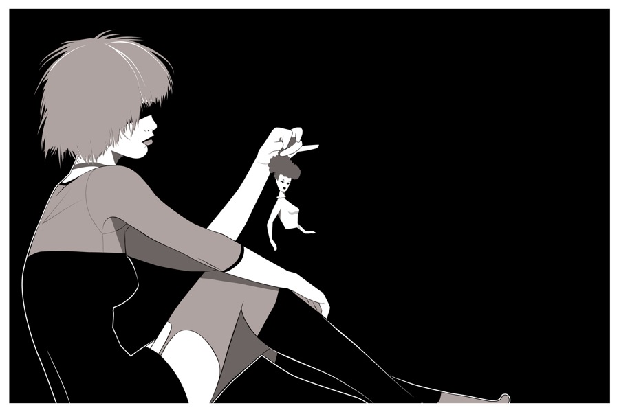
Mondo just showed off Craig Drake’s new poster for Blade Runner featuring Pris playing with a doll and I have to admit that I kinda like this poster. I know I’m a harsh critic with this kinda stuff but this one defied my expectations and produced a likeable poster. Check it out:
I like how Craig balanced the negative space and used a very limited pallette of grey. It promote good eye movement throughout the poster and makes it seem like a real poster rather than just a graphic by providing a good area for text. It’s a very simple and isn’t incredibly remarkable but is a recognizable image and implies characterization by use of the doll. Overall good image. Not something I’d order or hang on my wall but looks cool enough to be a desktop graphic for a while.
What do you guys think of this one? Hit or miss?
Via: Live For Films
