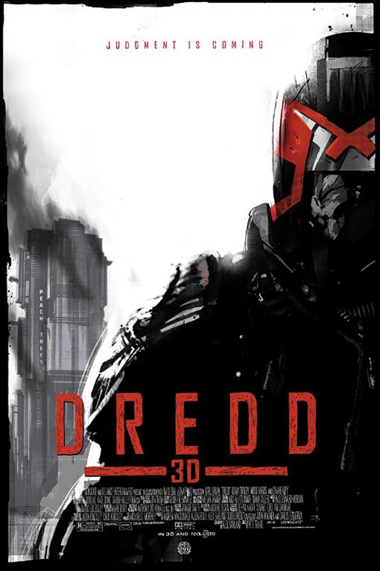
Another day another Mondo poster. In fact I came across 2 today but I’ll save the other for another post. This one is all about the poster that was created by Mondo’s “Jock”. Let’s not waste too much time, let’s just see if this one is more favorable than his poster for The Dark Knight Rises.
It might seem a tad “plain” at first but I see some really good use of positive and negative space in this poster. The font could use some work to help improve legibility but Jock is always improving with his limited palette use. The building in the back probably represents Mama’s headquarters in the film and promotes good eye movement and is just an overall good use of the rest of the canvas. I really like how he made Dredd’s chin seem extra chiseled and reminds me of Urban’s when in the suit.
Good job Jock! There, I DO have the ability to provide positive criticism to Mondo.
Via: Filmofilia
