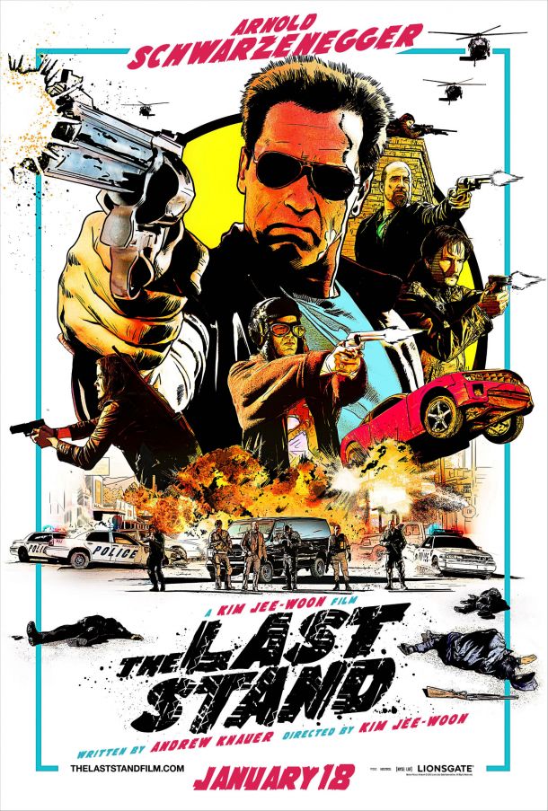
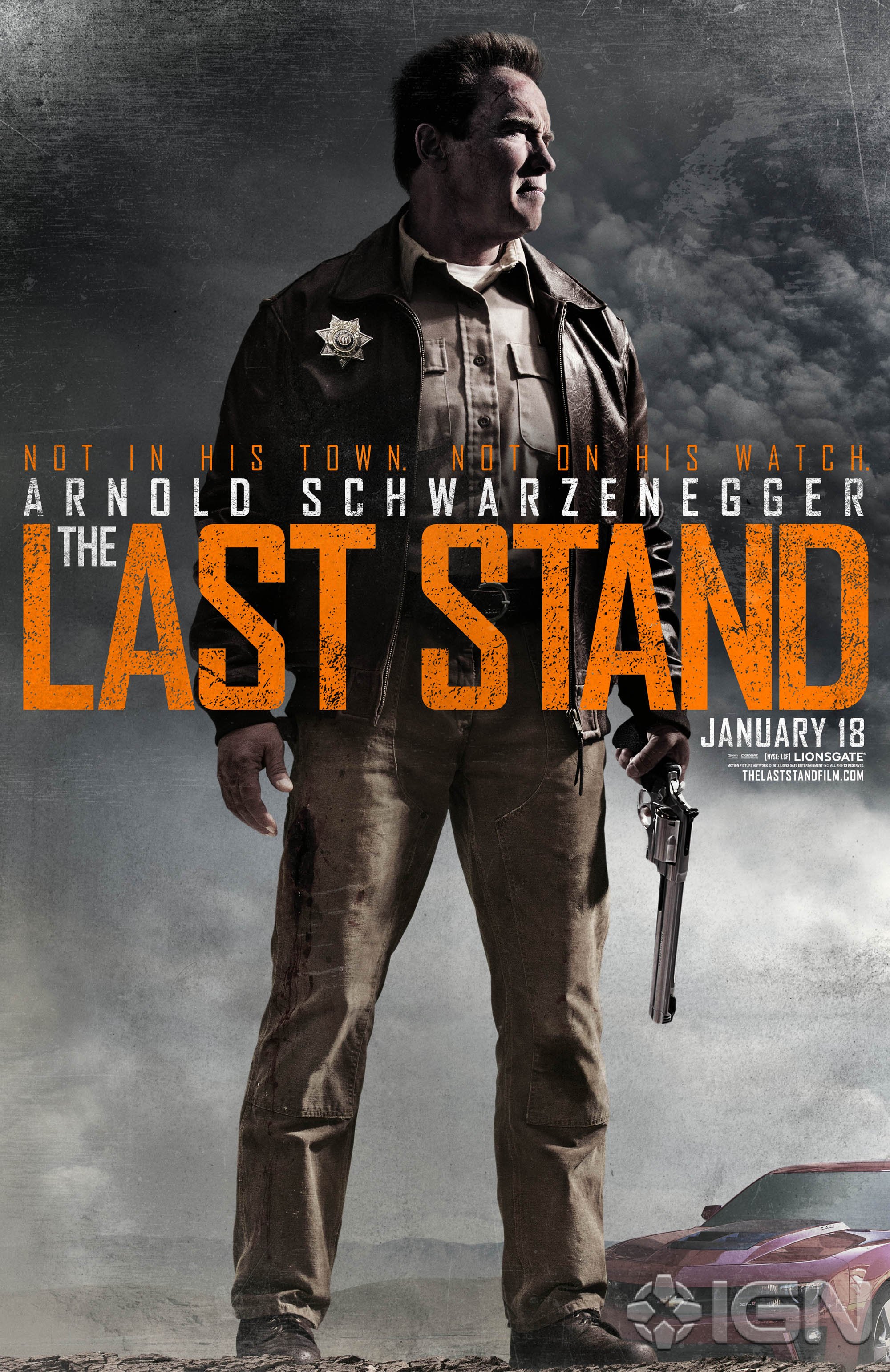
A new poster has come out for Schwarzenegger’s The Last Stand. And this one is a bit old school, in its illustrative vibe. I actually liked the first poster that was released outside of the needless Chevrolet product placement. Conceptually it had presence and the typography was solid and structured right in the middle. But then your eye gets drawn toward the product placement on the bottom right, messing up what should be a balance of background imagery. And nowadays we’re so trained to notice blatant product placement, like that Pepsi can isn’t there for no reason. Or yes, the Avengers are running behind an Acura. Marketing in my experience has rarely aided in inherent good design. It reminds me of an old saying ‘the worst of things have come from the best of intentions.’ But anyway.
This poster is an official poster for The Last Stand. I imagine you’d be hard pressed to actually find/see it in a theatre. Because again marketing. What’s cool doesn’t necessarily work for what is needed. I appreciate this poster right down to the type treatment, clear negative space and color use. If I was going to be nit-picky and I will be, the only thing throwing me off is the facial illustrations. They look more like a layered photo that was underneath and live traced with filter effects after the fact. Versus, going old school and illustrating it free-hand. I just don’t match Arnie’s hand, hair and everything else to the visual aesthetic I see illustrated on his face and then it carries to the other characters on the poster. It’s like a noisy carbon copy/render. Regardless, the poster is eye candy and it’s interesting to see something less traditional released, officially.
Via: Neogaf
