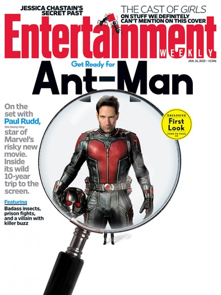
I’m all for Marvel dominating the silver screen and smashing the box office on a regular. Hell, I think of it as a treat but there are some things that Marvel does that I just take a ‘wait and see’ approach (*cough* Agents of S.H.I.E.L.D.). Not everything that’s put out by the ‘house of ideas’ initially looks great and Ant-Man fell in that category. I was all over the bandwagon and supporting the idea of Marvel bringing the character to the silver screen but as things get closer to release I have to admit that I am not a fan of the aesthetics.
I get that Marvel is trying to create costumes that seem…wearable or at least plausible for someone to wear with a justified reason for it to make sense, and his suit is like the reason he can shrink or something, but I just don’t like the way the suit looks or how the suit looks on Rudd. AT ALL.
Ant-Man is not one would call a “popular” super-hero or even one with favorable qualities and I can’t help but wonder if this is Marvel’s initial response to not having Spider-Man at their disposal. Hell, they even took the Spider-Man font from the comic to make the title text for Ant-Man.
Check out some more stuff below and feel free to sound off in the comments… if that seem’s OK to you.
;-)
[springboard type=”video” id=”1335755″ player=”tmbg001″ width=”599″ height=”336″ ]
That’s all for now…
