Alongside Mickey Mouse and the Super Mario Brothers, Sonic the Hedgehog is definitely one of the most instantly-recognisable mascots in popular media.
He has appeared in countless video games, is the star in one of the longest running comic book series in America, and has even made guest appearances in two Walt Disney Movies.
He cameoed in Wreck it Ralph and Ralph Breaks the Internet, and is even the star of the kind of online pokies Australia has available, simply titled Sonic the Hedgehog.
With this many sightings of the animated celebrity of the animated spiny mammal you wouldn’t be wrong if you assumed you would know what to expect from the feature film by Paramount Pictures. You couldn’t be more wrong.
The Teaser Post is Something Else
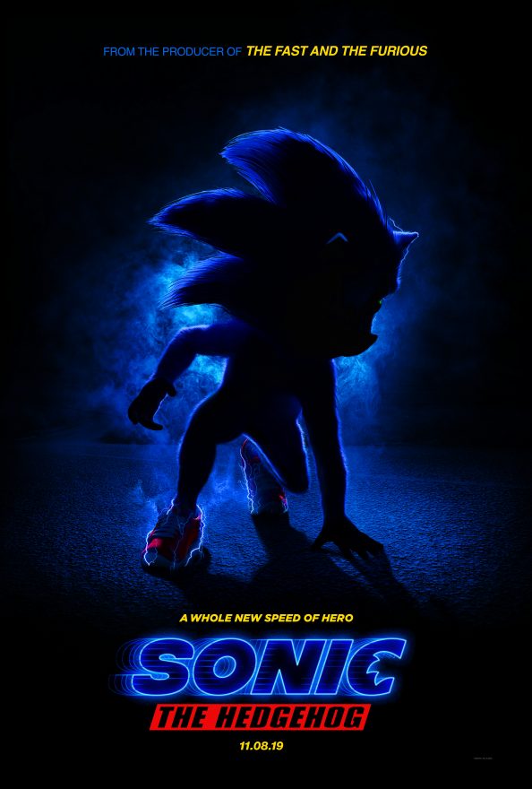
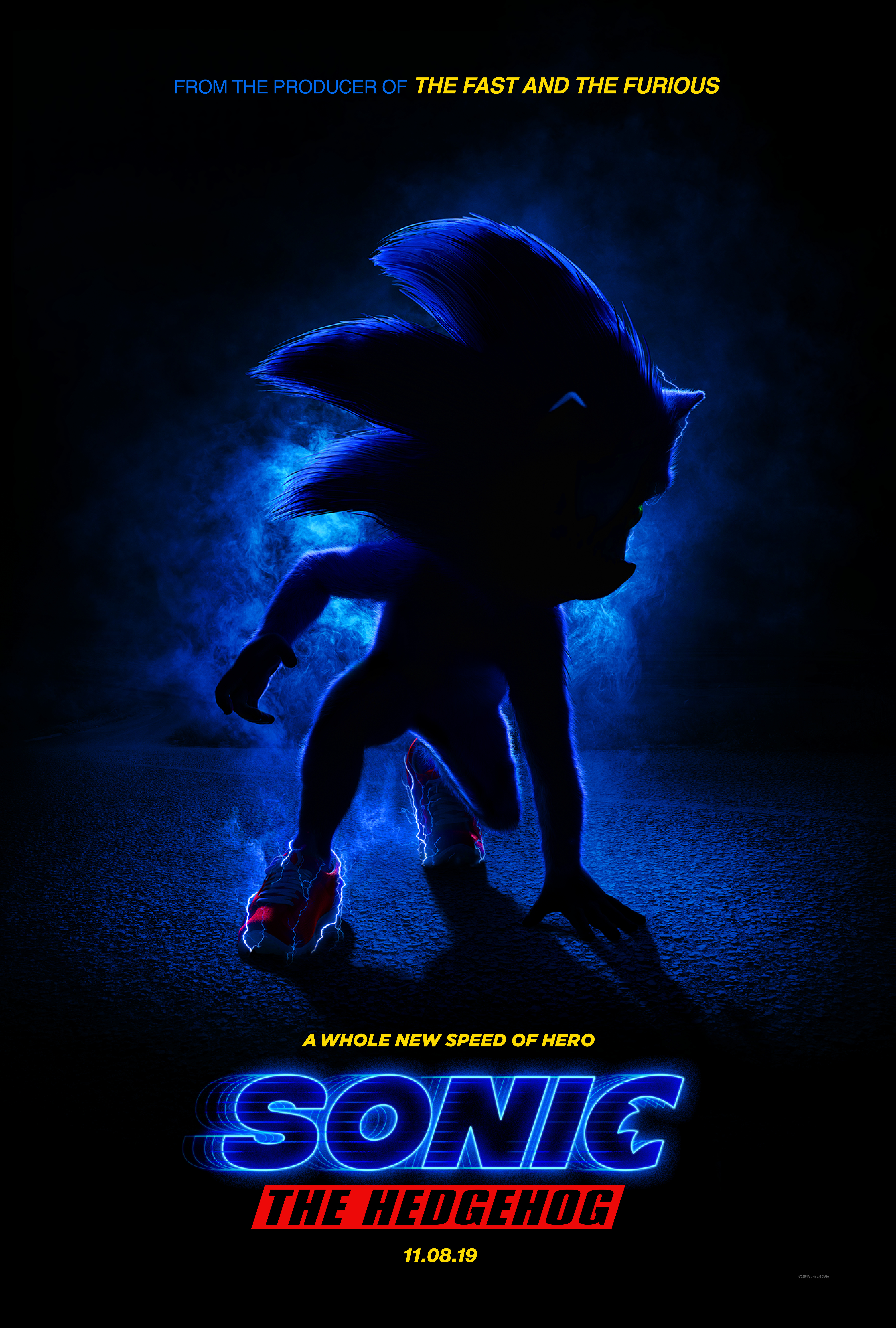
 The American film studio recently revealed a teaser post for the movie, and Sonic doesn’t look exactly the way you may remember him.
The image is draped in shadow, but besides that, the movie version of the animated hero is very clearly an entirely different one to the blue hedgehog we are used to.
The Sega version of the character is famous for supposedly being inspired by classic cartoon characters like Felix the Cat and Mickey Mouse, but the Paramount interpretation definitely looks more, ahem, humanised.
Something’s Not Right
His ionic spiny head is still there, but everything else seems to be a little off. He is now covered in a thin layer of shaggy fur, seems to have left his white gloves somewhere, and has weirdly realistic-looking muscles.
Considering how well established the cartoon’s classic design is, these changes are startling, to say the least, but the creators of the movie have defended their choices, saying that they were crucial. This is because although Sonic is traditionally a cartoon, his movie is set in the real world.
Tim Miller Has an Explanation

Mandatory Credit: Photo by Gregory Pace/BEI/Shutterstock (5584965fd)
Tim Miller, director
‘Deadpool’ film premiere, New York, America – 08 Feb 2016
In an interview with the American video game and entertainment media website IGN, Tim Miller, the executive producer for the film, stated that the changes were made in order to render the character more in tune with a live action setting.
Miller explained that he wouldn’t feel like a Pixar character might, because it was felt that this wouldn’t be the right aesthetic, and that’s why he’s wearing shoes that look real and has visible fur.
Miller warned the public that there were other changes coming too, and mentioned specifically a decision based on the character’s eye, which apparently Sega wasn’t 100% onboard with, which had to be changed because of the other alterations already in place.
Miller actually has a point here. In the cartoon world, Sonic’s one, connected eye somehow works, but it would be more than a little unsettling in the real world!
Miller ended off by saying that everything was a discussion, and that their goal was to only change what was absolutely necessary, staying true to as much of the original ideas as they could.
Twitter, meanwhile, has even built a moment around fans’ response to the new design and poster, claiming that the character design has divided fans. Devotees have respectfully disagreed, however, as it seems that absolutely everyone hates it!
-
Acting - /10
0/10
-
Cinematography/Visual Effects - /10
0/10
-
Plot/Screenplay - /10
0/10
-
Setting/Theme - /10
0/10
-
Watchability - /10
0/10
-
Rewatchability - /10
0/10


