They just released the first poster for the upcoming “The Soloist” movie with Robert Downey Jr. and Jamie Foxx. My friend Kris Tapley over at InContention.com put up an interesting little image showing just how overdone this sort of poster is.
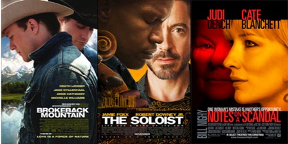
Here are some more with that whole one face behind another look to them:
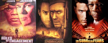
Now let’s be fair, there is only so much you can do with a poster and with thousands upon thousands of them being produced and created each year it is hard to be “original”. But this two faces style seems to be really over done.
Aside from the ones in the image above, what other movie poster can you think of that use this style as well. I’m thinking “Face/Off”.
Share this Story

