New Friday the 13th poster is on the loose. I thought I would let you know in case you hadn’t already dismissed it in passing.
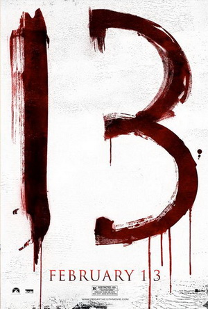
My problem with the poster isn’t the minimalist design. I can deal with that. Designers are not paid by the colour. But in this case Minimalist doesn’t portray the movie one bit.
See, in Friday the 13th, the date has one significance. It is the day that Jason died. In the original, his mother returns on his anniversary and exacts revenge on the free living teenagers that are partying in the campground. They just represent what she hates so it’s on. In the new incarnation Jason himself is opening the can.
There are not 13 of anything. This doesn’t happen 13 years later. Its a date. Aside from that it has no impact on the plot or the movie. So why are they throwing this 13 up like it is supposed to stand for everything this movie is about. Oh, I get it. Its written in blood. How clever. Its still a number that has little or nothing to do with the plot.
A bloodstain on a calendar marking that day? That might be a better use of the number on its own. But really a picture of Jason with a bloodstained axe or machete would have been far better placed.
I’m not impressed.
Via.


