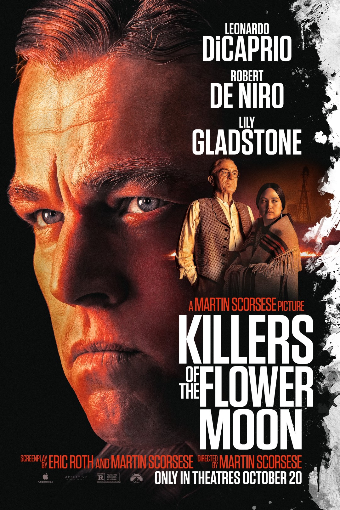
I don’t think I outright call a poster “Bad” very often. In fact I’m pretty sensitive to the effort that some designers put into these posters considering I understand the amount of time and effort that someone can pour into one of these things and think it’s great and some that are surprise hits. This is one of those posters where I feel that they missed the mark and instead developed something that’s generic and not at all enticing. Seeing this hanging in a theater the only thing that would catch my eye is the Total Recall title and everything else just seems like “more of the same”. Sometimes it takes just the right marketing to convince someone to see a film whether it’s a good trailer playing before a film, or just the right joke that caught my attention during a tv spot, or just the right imagery in a poster to make a film stick to my radar. This, unfortunately, caused the opposite effect and actually knocked it down a nudge on my list and makes me hope that they took more care to the actual film than they did with this poster. What’ sso bad about it? The sappy look on Colin Farrel’s face, the fact that he’s floating in a collage of landmarks and backgrounds, and the obviously photoshop’d and airbrushed images of woman just staring aimlessly at nothing. Shame on them.
Via: JoBlo
