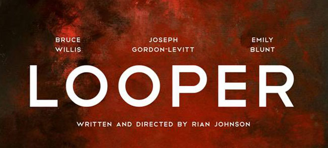
I just came across this new Looper poster which is decisively different from the other promotional materials we’ve seen for this film and I’m learning that there’s a specific reason for that. This poster isn’t for the movie. Not really anyway, apparently there’s some sort of animated tie-in for the film that will debut on the Apple website on Monday and they may or may not use this illustrated style of art.
I’m not sure how I feel about this. It’s a very interesting poster and seems more like it belongs in a museum than hanging on a theater wall. I can’t decide whether I like it or not because it just seems inappropriate for this kinda film. Then again I haven’t seen the film or the animated piece so maybe I’m dead wrong. I’m gonna leave it alone and come back and see if my feelings change. I’ll let you know in the comments…
Via: Jo Blo


