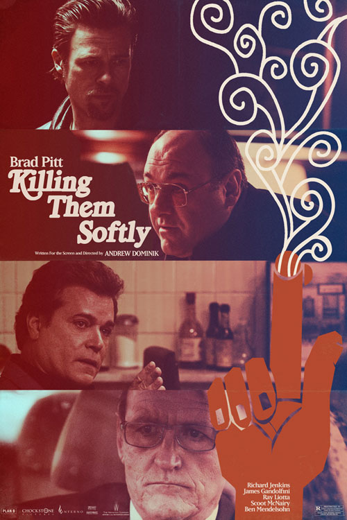
A few new posters for Killing Them Softly have been released over on Fandango and they take the theme that we’ve been seeing in the last few posters and further exploit the slightly off-kilter approach. Not sure what I mean? take a look:
They’re a little weird. Not sure if I like them or not. I asked Elliot cus he’s our resident graphic design expert and he was baffled too:
honestly, I don’t know. Other than being stylistic…it’s hard to view these without the context of the movie before calling them dumb.
Yeah, what he said. What do you think?
Via: Fandango
Share this Story
